IROCE [DK]
Logo design for Danish NGO.
Logo design
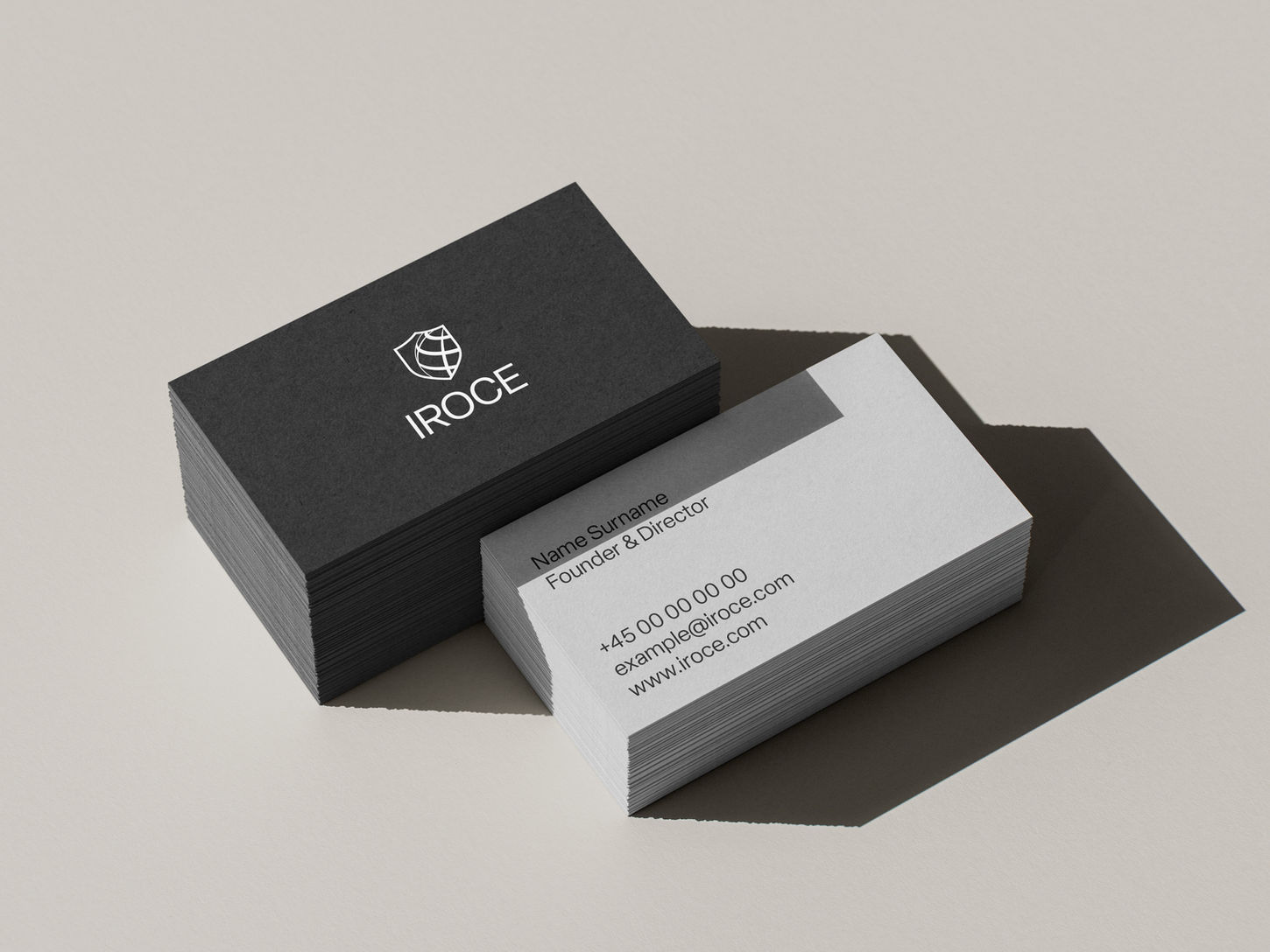
IROCE is a Danish non-profit organisation based in Copenhagen, uniting international expertise and local action in the fight against online child exploitation. My role was to design a logo that reflects IROCE’s international scope, professionalism, and mission to protect and respond. The goal was to create a visual identity that feels trustworthy and authoritative, yet not overly institutional — something that communicates both strength and humanity.

The final logo combines two main elements: a shield and a globe.
The shield represents protection, response, and authority — key values of the organisation’s mission. Its sharp and clean form gives the logo a confident and respectful tone, suitable for collaboration with law enforcement and global partners.
The globe, subtly stylised with a 3D grid effect, symbolises international cooperation and IROCE’s role as a global ally against online exploitation. Its placement within the shield unites the ideas of protection and worldwide reach, reinforcing the message of global solidarity and action.
The overall design is minimal, timeless, and clear, allowing it to work across various applications — from official documents and training materials to digital and web environments.

To ensure the logo always appears clean and readable, it’s important to maintain clear space — also known as the protection zone — around it. This zone defines the minimum distance between the logo and any other graphic elements or the edge of the format. The clear space is determined as half the height or width of the logo, depending on which dimension is most relevant. No text, images, or other design elements should enter this area.

The monochrome colour palette ensures a professional and trustworthy visual identity. Black and white serve as the foundation for clarity and contrast, while the grey tones provide flexibility for backgrounds, highlights, and subtle hierarchy. Together, they create a timeless, balanced system that adapts across print and digital materials without losing authority or readability.
Typography plays a key role in maintaining IROCE’s clear and authoritative tone. The Elza type family was chosen for its modern, balanced, and professional appearance — ensuring consistency across all communications.


